Frosted UINavigationBar
Many thanks to Brian Capps for the following tip.
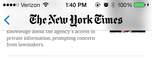
I wanted to achieve the frosted glass look of the iOS 7 UINavigationBar on the NYTimes iPhone app:

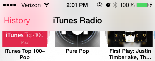
which displays the colors of the content underneath more vibrantly than the default UINavigationBar in apps like Music:

I reached out to Brian, a developer on the NYTimes app, who offered the following explanation:
"The iOS 7 navigation bar has two blur "modes" (this isn't documented, simply what I've found in testing). If you keep the default nil `barTintColor` on the navigation bar then the blur is very subtle and includes color (a la Mail or most Apple apps). If you set any UIColor to the `barTintColor` the blur changes to be more dramatic, and all blurred colors are desaturated to gray. So in our case we set the `barTintColor` to UIColor whiteColor and achieved the more "frosted" look with a little bit more dramatic blur. If you want to turn up the blur even more, you can also use a color with a lower alpha."
Simple.
